Post-production techniques and processes P5 (U3) and Meeting the client brief P5, M4, D1 (U3)
Learning Outcome 4 (U3): Be able to carry out post-production techniques and processes for an original media product to a client brief.
This is my finalised front cover which was made on photoshop. I have had to use post production techniques during the creation of this. I have edited the background so that the main model stands out more
Review of suitability P5 (M3)
Post production tools, how they create meaning and how it links to the client brief P5, M4, D1 (U3)
Front Cover
Boxes and reduced opacity:
I used the box tool and made the rectangle white behind some of my cover-lines. The white box seemed far too harsh (left image), so I used the opacity tool to make it more transparent (middle and right image). This allowed the location to still be seen, which creates meaning as it demonstrates the importance of the location. As discussed earlier, the location was from in North London and this links directly back to the client brief. Not only that, but the use of colours and more specifically white with green seeping through reflects the vibrancy (brief) of the location. I used the colour white to connote innocence of my artist, which was important as the magazine is for a young target audience.
Colour correction:
 I used the colour correction tool enhance the green background for my front cover. I chose to enhance the green colours as it reflects the festival location/theme of the magazine. This was all original content (brief) and also links to the North London focus of my magazine. I wanted the magazine front cover to look striking and feel that this was achieved successfully. It's important that my magazine stands out to my target audience.
Drop shadow on text:
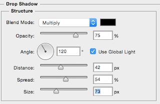
 I chose to use the drop shadow tool on my text so that that specific cover-line would stand out to my audience. I chose to do this on the colour red to emphasise the passion that my artist and indeed readers would have for this magazine and festivals. Additionally as festivals take place in the summer time, the colour red links to the heat of summer. I chose to drop shadow that specific cover-line as it promotes another North London artist - which links to the brief as it promotes upcoming talent in North London. Adding in this drop shadow really makes this seem important and stands out to my target audience.

Layering the masthead:
I considered my layers a lot throughout the process of production as I know how important layering is. I wanted the name of my magazine to be the most important as this would help to create a strong brand identity. I also put the name of my magazine in black as black connotes importance/dominance. It also looks professional and I wanted to use multiple font colours throughout my magazine. Doing this links to the client brief as it reiterates that there is a vibrant music scene developing locally and people need to know about it. This is a clear indication of me using tools to create meaning, whilst also linking to the client brief.
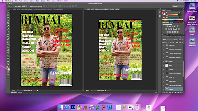
This is evidence of me making changes to the front cover of my magazine. I have made changes to the font, where writing is placed, colour and added information such as the date in the top right hand corner. The left side is the old version and the right side is the updated version of the magazine.
I had to think about my composition to ensure that the most important content, whether it was North London focused or genre focused, was made evident to my target audience.
Double Page Spread
Magnetic Lasso and colour correction:
Before with the magnetic lasso
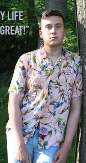
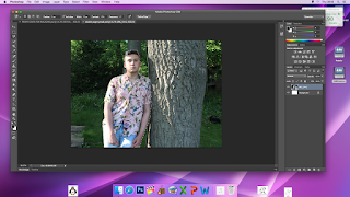 This is evidence of me cropping my model for my magazine on photoshop. I am going through the process of cropping him out using the magnetic lasso tool, so that I can make the colours of his shirt stand out more. I wanted the colours of his shirt to be the most vibrant to once again reflect the vibrant music scene (brief), as this is what would significantly appeal to my target audience. Also my consumers may see my artist as a role model and then buy the same clothing.
Rotating and selecting:
The original image I photographed was on a slant, this is evidence of me rotating the picture I took on photoshop so that the model can be in line with the page and not slanted.
I wanted my artist to be the main focus on my double page spread, as this magazine was all about promoting festivals and indeed artists who performed at these North London festivals (brief). With this in mind, it is important that the main image is the main focus of the entire double page spread. This was achieved by using the select/slant tools. This links to the client brief as it was original content that I manipulated to create meaning.
Gradient tool and box:

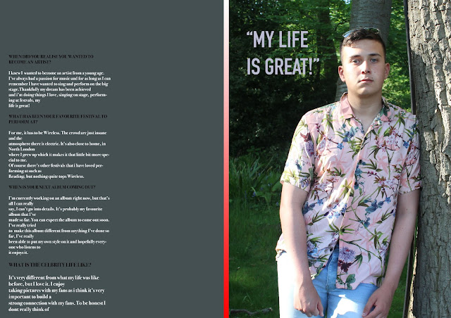
 Finally, to split the pages on my double page spread, I created a long rectangle and used the gradient tool to add in colour. I used the colours red and white as these were key to my colour scheme. I wanted the colour red to connote the passion that my artist had, whilst also reflected the summer time atmosphere that people feel at festivals. This links to the client brief as it reflects the vibrant music scene
developing locally and was original content. Additionally, this will be used across our online platform to further create brand identity which links to the client brief of producing a new online and
print based music magazine for North London.
<---- This is the red colour gradient tool that I used to split the pages.
This is my finalised front cover which was made on photoshop. I have had to use post production techniques during the creation of this. I have edited the background so that the main model stands out more

This is my double page spread. it features an interview with the artist who features on the front cover of my magazine.
Both have been exported as JPEGS.
Review of suitability P5 (M3)
Front cover strengths and how they link to your target audience
The vibrant colours used in the front cover are one of its main strengths in my opinion, and this links to my target audience because my target audience are young adults and many young adults are quite vibrant and so will be instantly attracted to my magazine front cover because of this.
Another strength of the front cover is that in the picture on the front cover, the artist is wearing, summer, vibrant clothes which is what many people would wear at a festival. This links to my target audience as this is similar sort of clothing to what I wold expect them to wear to a festival or even just out and about.
Front cover weaknesses and how they don't link to your target audience
One weakness of the front cover is that doesn’t feature an artist at an actual festival which doesn’t link to my target audience as my target audience enjoys festivals and there’s no real link in the main picture of my front cover to a festival.
Another weakness of the front cover is that the font used isn’t particularly modern, despite the fact that most of the audience are young and so will be into the more modern look, which is exactly the reason why it doesn’t link to my target audience.
Double page spread strengths and how they link to your target audience
One of the strengths of my double page spread is that it includes a lot of interesting questions and interview answers with the artist. This links to my target audience as my target audience would be very interested to see what the artists had to say since it is that age group that listen to the artist being interviewed the most.
Another strength of the double page spread is that the colours used are modern and vibrant, which also links to my target audience since at that age they are very modern and vibrant people interested in modern and vibrant looks.
Double page spread weaknesses and how they don't link to your target audience
One weakness of the double page spread is that some of the questions from the interview aren’t too exciting which may disappoint some readers. This doesn’t link to my target audience since it is the age of my target audience that listen to the artist the most and so will want exciting questions asked for him to answer.
Another weakness of the double page spread is that there aren’t that many questions asked in the interview that features in the double page spread. This doesn’t link to my target audience because my target audience would want to see more questions being asked to the artist as it is that age group that make up the majority of that artists fans.
Post production tools, how they create meaning and how it links to the client brief P5, M4, D1 (U3)
Front Cover
Boxes and reduced opacity:
I used the box tool and made the rectangle white behind some of my cover-lines. The white box seemed far too harsh (left image), so I used the opacity tool to make it more transparent (middle and right image). This allowed the location to still be seen, which creates meaning as it demonstrates the importance of the location. As discussed earlier, the location was from in North London and this links directly back to the client brief. Not only that, but the use of colours and more specifically white with green seeping through reflects the vibrancy (brief) of the location. I used the colour white to connote innocence of my artist, which was important as the magazine is for a young target audience.
Colour correction:
 I used the colour correction tool enhance the green background for my front cover. I chose to enhance the green colours as it reflects the festival location/theme of the magazine. This was all original content (brief) and also links to the North London focus of my magazine. I wanted the magazine front cover to look striking and feel that this was achieved successfully. It's important that my magazine stands out to my target audience.
Drop shadow on text:

 I chose to use the drop shadow tool on my text so that that specific cover-line would stand out to my audience. I chose to do this on the colour red to emphasise the passion that my artist and indeed readers would have for this magazine and festivals. Additionally as festivals take place in the summer time, the colour red links to the heat of summer. I chose to drop shadow that specific cover-line as it promotes another North London artist - which links to the brief as it promotes upcoming talent in North London. Adding in this drop shadow really makes this seem important and stands out to my target audience.
Layering the masthead:
I considered my layers a lot throughout the process of production as I know how important layering is. I wanted the name of my magazine to be the most important as this would help to create a strong brand identity. I also put the name of my magazine in black as black connotes importance/dominance. It also looks professional and I wanted to use multiple font colours throughout my magazine. Doing this links to the client brief as it reiterates that there is a vibrant music scene developing locally and people need to know about it. This is a clear indication of me using tools to create meaning, whilst also linking to the client brief.

This is evidence of me making changes to the front cover of my magazine. I have made changes to the font, where writing is placed, colour and added information such as the date in the top right hand corner. The left side is the old version and the right side is the updated version of the magazine.
I had to think about my composition to ensure that the most important content, whether it was North London focused or genre focused, was made evident to my target audience.
Double Page Spread
Magnetic Lasso and colour correction:
Before with the magnetic lasso

 This is evidence of me cropping my model for my magazine on photoshop. I am going through the process of cropping him out using the magnetic lasso tool, so that I can make the colours of his shirt stand out more. I wanted the colours of his shirt to be the most vibrant to once again reflect the vibrant music scene (brief), as this is what would significantly appeal to my target audience. Also my consumers may see my artist as a role model and then buy the same clothing.
After cropping out my artist and enhancing the colours, then replacing him back on the background
Rotating and selecting:
The original image I photographed was on a slant, this is evidence of me rotating the picture I took on photoshop so that the model can be in line with the page and not slanted.
I wanted my artist to be the main focus on my double page spread, as this magazine was all about promoting festivals and indeed artists who performed at these North London festivals (brief). With this in mind, it is important that the main image is the main focus of the entire double page spread. This was achieved by using the select/slant tools. This links to the client brief as it was original content that I manipulated to create meaning.
Gradient tool and box:
<---- This is the red colour gradient tool that I used to split the pages.


Comments
Post a Comment